For anyone who has ever chosen paint colors, you know how important it is to view potential color choices in the space where they will ultimately be used. And you also know how difficult it is to choose a color using a tiny swatch held up against a field of some other color (your wall). Well, the truth is (or at least my opinion of the truth) is that unless you have developed visualization skills, or a lot of experience choosing paint colors for different spaces with different lighting conditions, then those tiny color swatches are pretty much useless.
Sure, paint swatches allow you to see a wide range of subtly different colors in relation to each other – you can tell if ‘Autumn Gold’ is lighter and more yellow than ‘Happy Yam’ – but when it comes to predicting what a color will look like when you are surrounded by it, well, that’s essentially up to your imagination. Even basic color categorizations like ‘warm’ and ‘cool’ become less clear when you place a swatch in different lighting conditions and against fields of other colors. Color is not absolute – context always defines the things we see.
So does this mean that trying to choose the perfect color is an act of futility? Does it mean that we should just give up and paint everything builder beige? Well no (please no), but it does mean that choosing color is not, er, black and white. The thing about color is that it is always relative and it is always changing, depending on light and context. And the secret to designing with color is to envision how a space is going to feel – this is especially true when designing with concrete.
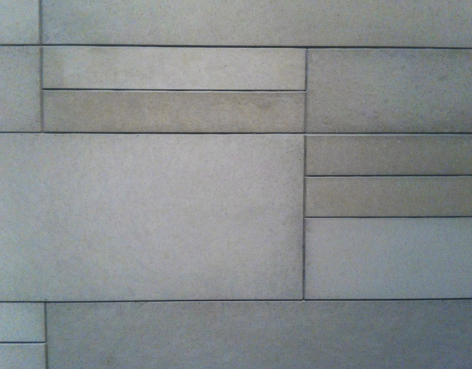
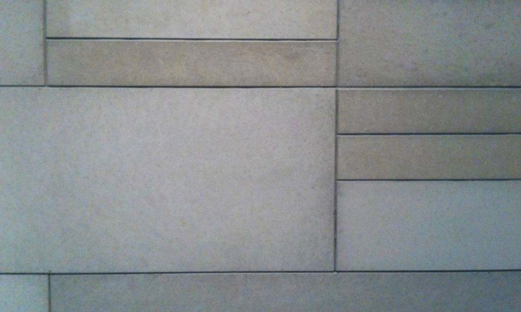
Cast concrete naturally has a degree of colour variation within each piece and from one piece to another. This is what makes it feel natural and really, one of the fundamental aspects of its beauty. There is always variation so when choosing concrete colour it is absolutely more about how it feels than it is about the eye measuring the ‘exactness’ of a colour. How will an installation of concrete tile on a wall, or a fireplace surround feel in the context of a space? Colour is certainly a significant aspect of this, but it has as much to do with shape, mass, texture, and the way it balances or counterpoints the other elements in a space. And, of course, it will feel different different times of the day.
The moral of this story is that colour, especially in cast concrete, is far from absolute. Concrete’s colour is inseparable from its other intrinsic characteristic: its “concreteness.” This is one of the reasons why Paloform doesn’t have hundreds, or even dozens of colours in its offering. When designing with cast concrete, it is most valuable to aim for an aesthetic feel and consider how the various elements, materials, textures and colours in space are going to balance and complement each other to create that feeling.
To illustrate the point of how subjective and almost fleeting the idea of colour is, here is a fascinating and amazing Ted Talk by Beau Lotto.